A medical information system focused on fast access, clarity, and privacy in critical situations.

2023
Project Type
UXUI Design
Hi-Fi Prototype
Software
Figma
Notion
Illustrator
FigJam
Overview
Medical App is a mobile application designed to centralize and securely share critical medical information via QR codes. It is intended for emergency scenarios and first medical consultations, where time, clarity, and trust are essential.
The project prioritizes reducing friction when accessing sensitive data, while maintaining user control, privacy, and confidence in the system.
Most existing health solutions focus on tracking or wellness, but fail to support fast, structured medical information sharing when it truly matters. Information is often fragmented, outdated, or inaccessible in critical situations.
Additionally, overly complex information architectures discourage long-term use, especially in a domain where clarity and trust are non-negotiable.
Although the product did not reach production, the outcome established a solid foundation for future validation and scalability.
Improved clarity and scanability of medical information
Reduced friction during data entry and updates
A structured base ready for AI-assisted features
Strong alignment between user needs and technical feasibility
My role covered the end-to-end UX/UI process, with a strong focus on structured data capture, scalable information architecture, and stress-aware interaction design.
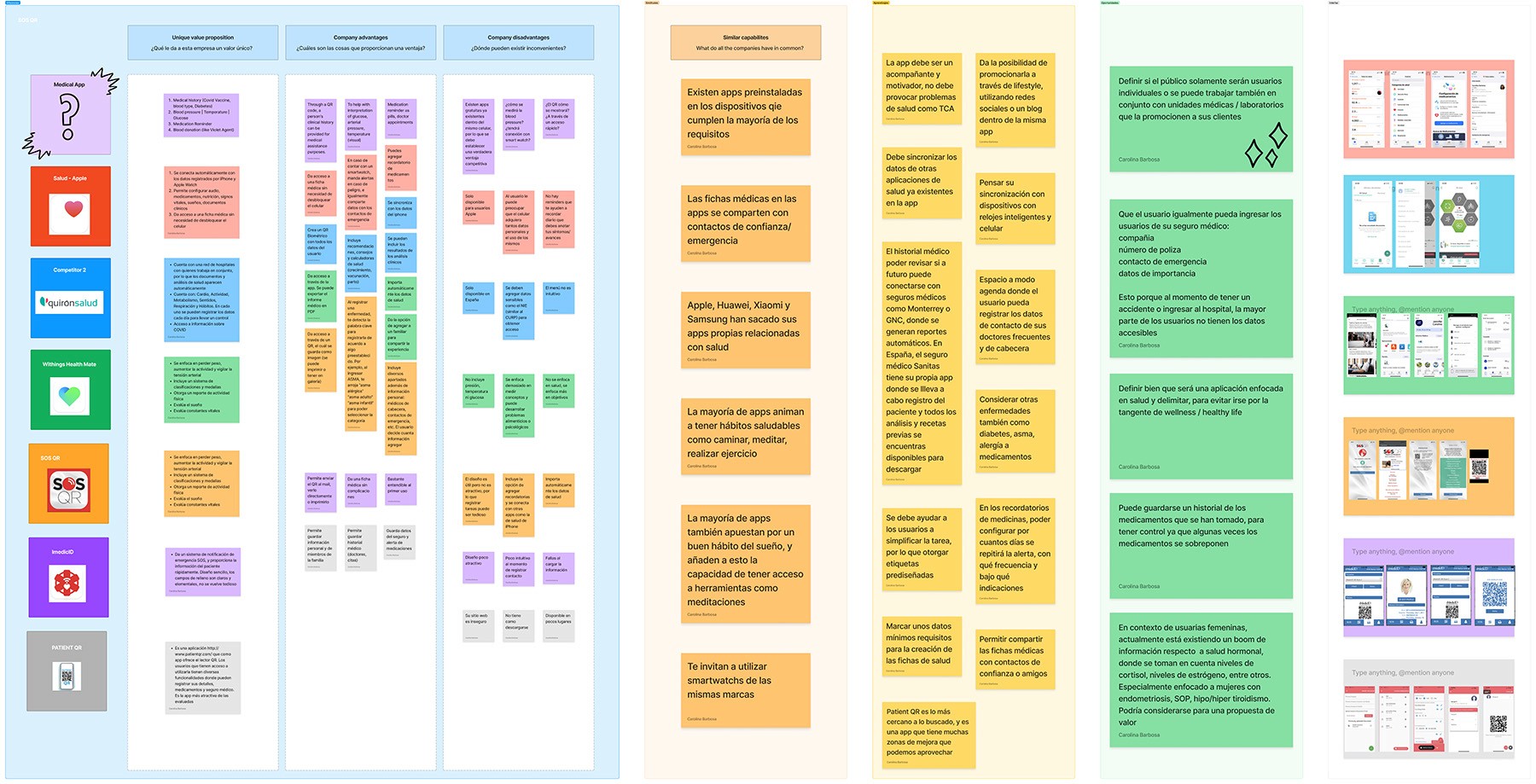
A benchmark of existing medical and health-related applications was conducted to identify gaps, friction points, and structural limitations in current solutions. The analysis focused on how often these products are realistically used and why users tend to abandon or stop updating their medical information over time.
The main opportunity identified was the lack of systems designed for frequent, low-effort use, capable of encouraging users to keep their medical data updated and to actively maintain a complete medical record, rather than treating it as a one-time setup task.
Benchmark
Rather than relying on traditional personas, the design was driven entirely by real-world usage scenarios that reflect how and when medical information is actually accessed or updated.
The system was shaped around three core scenarios:
Designing around scenarios ensured the system responds to concrete contexts and temporal needs, positioning the medical record as a living, continuously updated system rather than a one-time setup or static profile.The system was shaped around three core scenarios:
Low-effort input is essential for frequent updates
Scenarios that require regular data updates demand structured inputs, tags, and predictive concepts to avoid abandonment.Neutral language matters in medical contexts
Metric-driven or comparative narratives increase anxiety and reduce trust. A calm, non-competitive tone supports sustained use.Clear separation between health and wellness builds trust
Mixing medical records with lifestyle features dilutes purpose and complicates decision-making in critical contexts.
Mobile App Design
The solution was framed as a modular medical information system, organized by user intent rather than technical complexity.
The product behaves as a “living medical card”: always up to date, easy to share, and designed to be understood in seconds by both users and healthcare professionals.
UI Design
The interface adopts a minimal, clinical visual language, where the UI supports information rather than competing with it.
Material Design 3 was used as a base system to ensure consistency, accessibility, and feasibility for future development. Customization focused on hierarchy, spacing, and interaction states, reinforcing predictability and reducing friction across flows.
As the product does not yet have a defined brand identity, visual decisions prioritized system robustness over stylistic expression, ensuring that branding can evolve later without compromising usability or structure.

The information architecture was designed around intent-driven modules, ensuring that each section responds to a specific user need without increasing cognitive load.

Within these modules, medical data is further organized using clear categories (e.g. conditions, allergies, blood group, implanted devices), allowing information to remain readable and scannable even as complexity increases.
This modular structure ensures that each section can evolve independently, while remaining coherent as part of a single system.
From structure to prototype
The onboarding was designed as a dual-purpose layer: introducing the product’s core functionality while progressively collecting the most relevant medical data.
Rather than treating onboarding as a one-time explanation, it functions as the first step in personalization. Key data is captured through structured components that immediately shape the content shown to the user, allowing the system to adapt from the start without overwhelming the experience.


Each module supports a specific type of interaction—reviewing personal information, sharing critical data, maintaining medication records, or organizing documents—allowing users to update their information incrementally over time.
This modular structure promotes clarity, predictability, and sustained use, encouraging users to keep their medical information organized and up to date.


Next Steps
Hormonal health as an optional expansion layer
Growing interest in hormonal data (e.g., cortisol, estrogen levels) suggests an opportunity to extend the system. This layer would remain optional and clearly separated from the core medical record, preserving clarity, trust, and system simplicity.