
2017 - 2019
Project Type
Freelance
End-to-end
Experiment
Software
Claude Code
Cursor
Illustrator
Photoshop
Overview
GyC’s digital and visual presence originally consisted of a standalone logo, with no defined brand system or structured online platform to represent the company’s work, values, or internal structure.
The project began as a branding initiative focused on designing a cohesive visual identity and translating it into a functional website. The goal was to create a solid brand foundation that could support digital growth over time.
In 2026, while reformulating my portfolio, I revisited this project as an opportunity to rethink and improve the original website made in WebFlow —now using Claude Code and Cursor— to explore how the same branding system could evolve with new tools and practices.
The starting point was the need for a recognizable and coherent brand presence.
Rather than solving a functional problem, this project aimed to define tone, visual direction, and personality, creating a foundation that could evolve over time.
I led the branding process end to end, defining the visual identity, brand system, and corporate applications.
In the first iteration (2019), my role also included interface design and information architecture for the company’s website, which was built using Webflow to enable scalability and content updates.
In the second iteration (2026), I revisited the website as an experimental redesign exercise, focusing on improving structure, clarity, and visual hierarchy. This phase explores rebuilding and enhancing the site using Cursor and Claude Code as part of a modern design–development workflow.
The early phase focused on understanding the company’s identity, internal structure, and visual needs.
Exploration included shape studies, color testing, typographic trials, and compositional experiments, with a strong emphasis on clarity, structure, and long-term usability rather than trends.

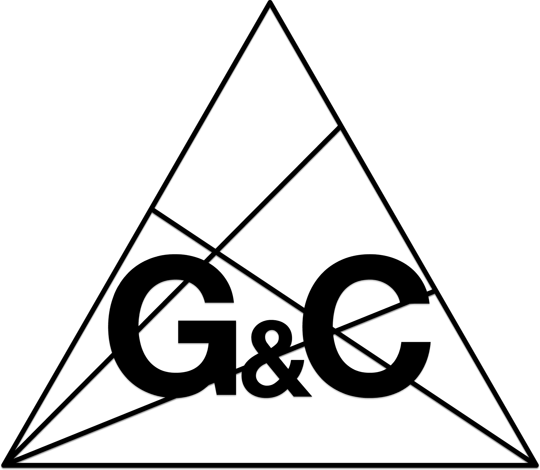
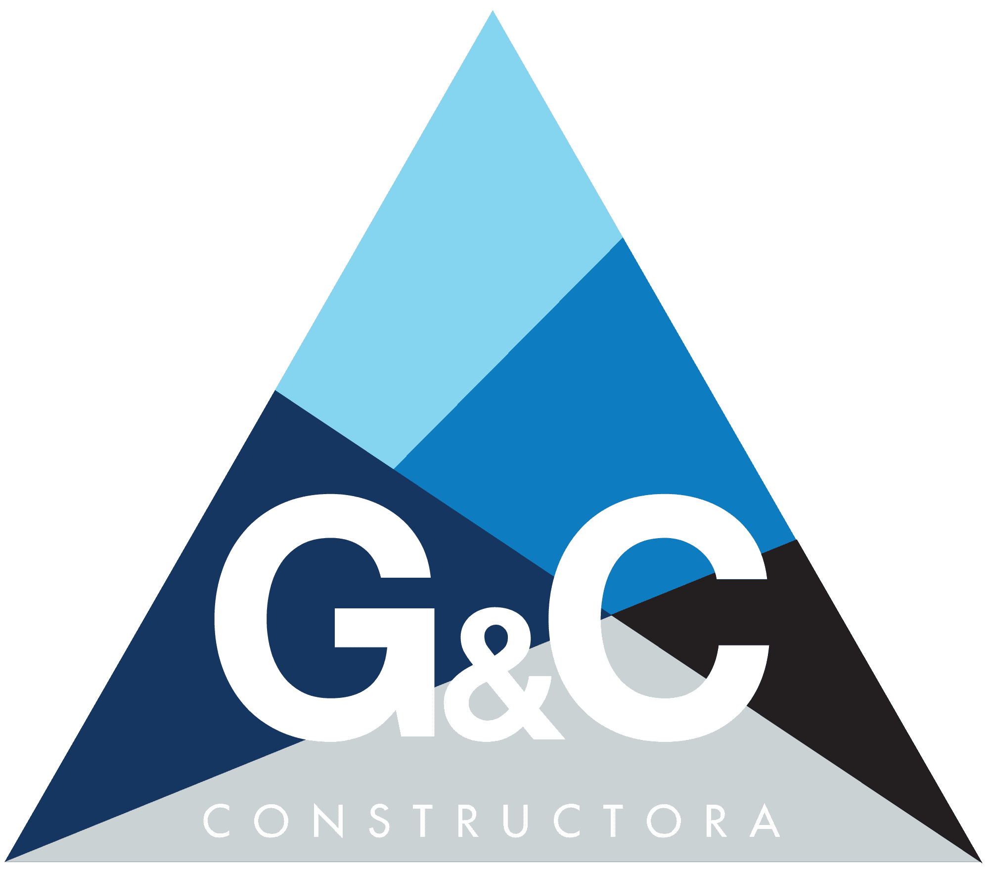
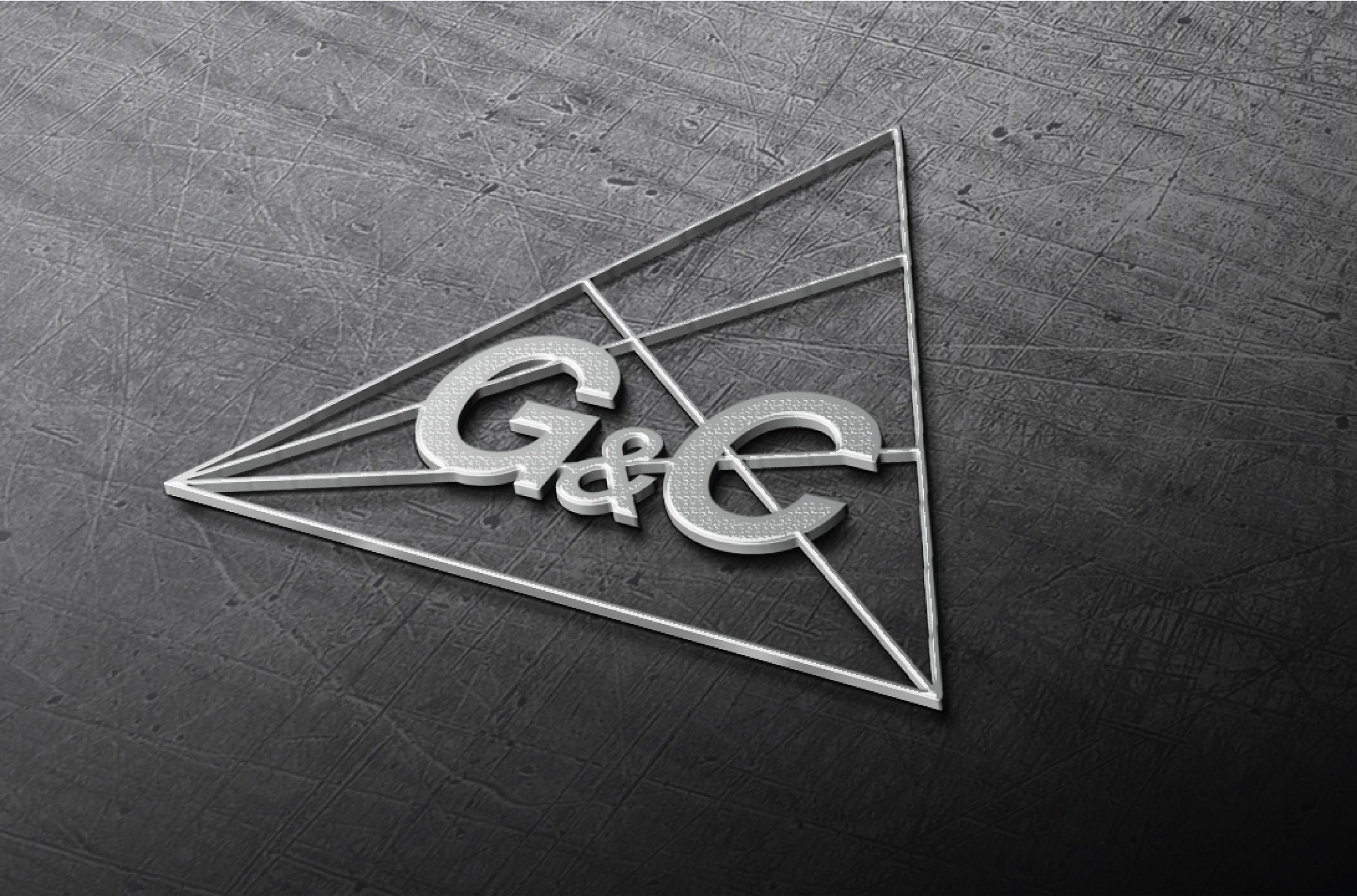
A key requirement was preserving the triangular shape from the original logo. This form became the base of the new identity, symbolizing structure, construction, and collaboration.
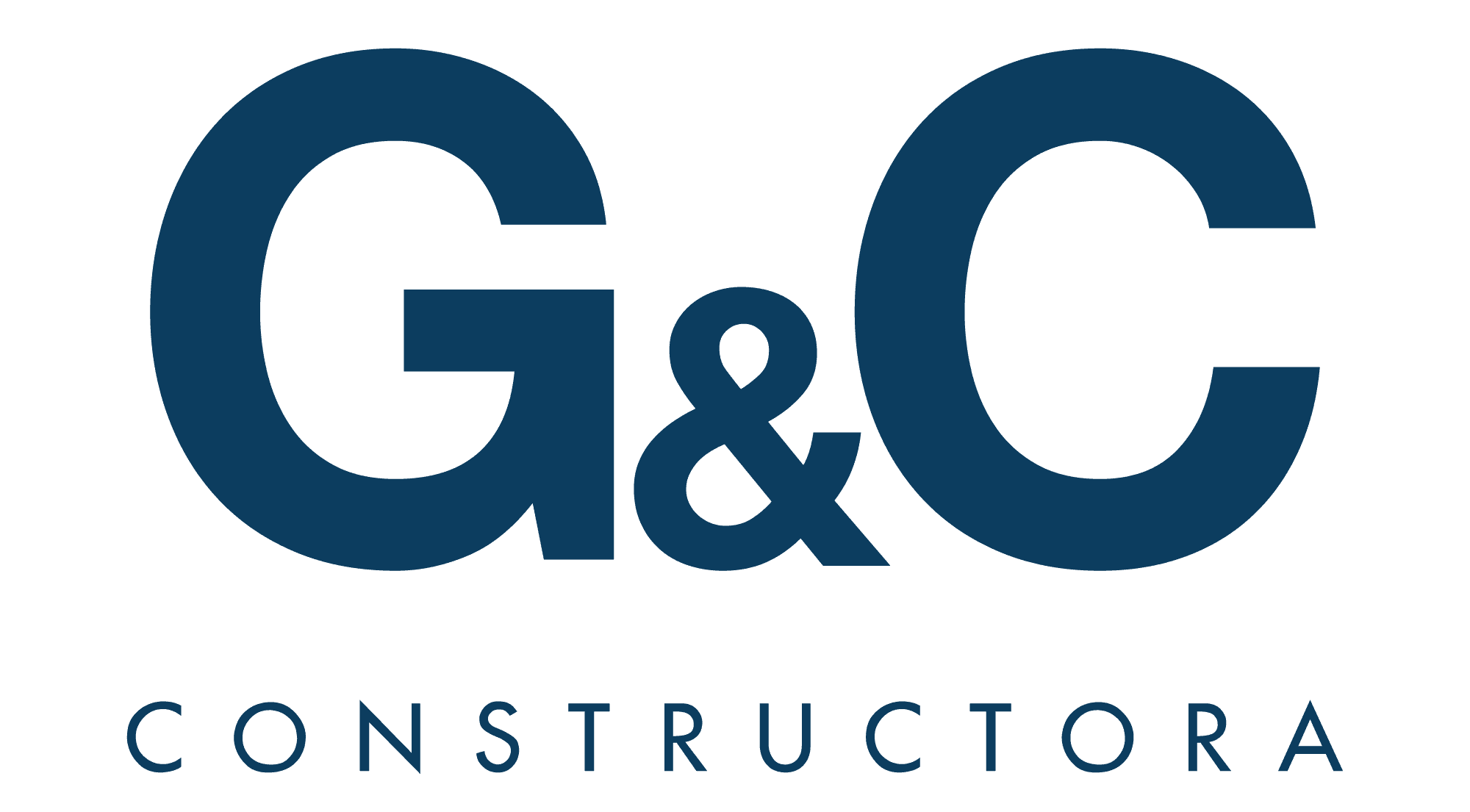
The imagotype combines geometric forms and line-based compositions, with the logotype layered on top. The result is a system that visually communicates unity through multiple elements.

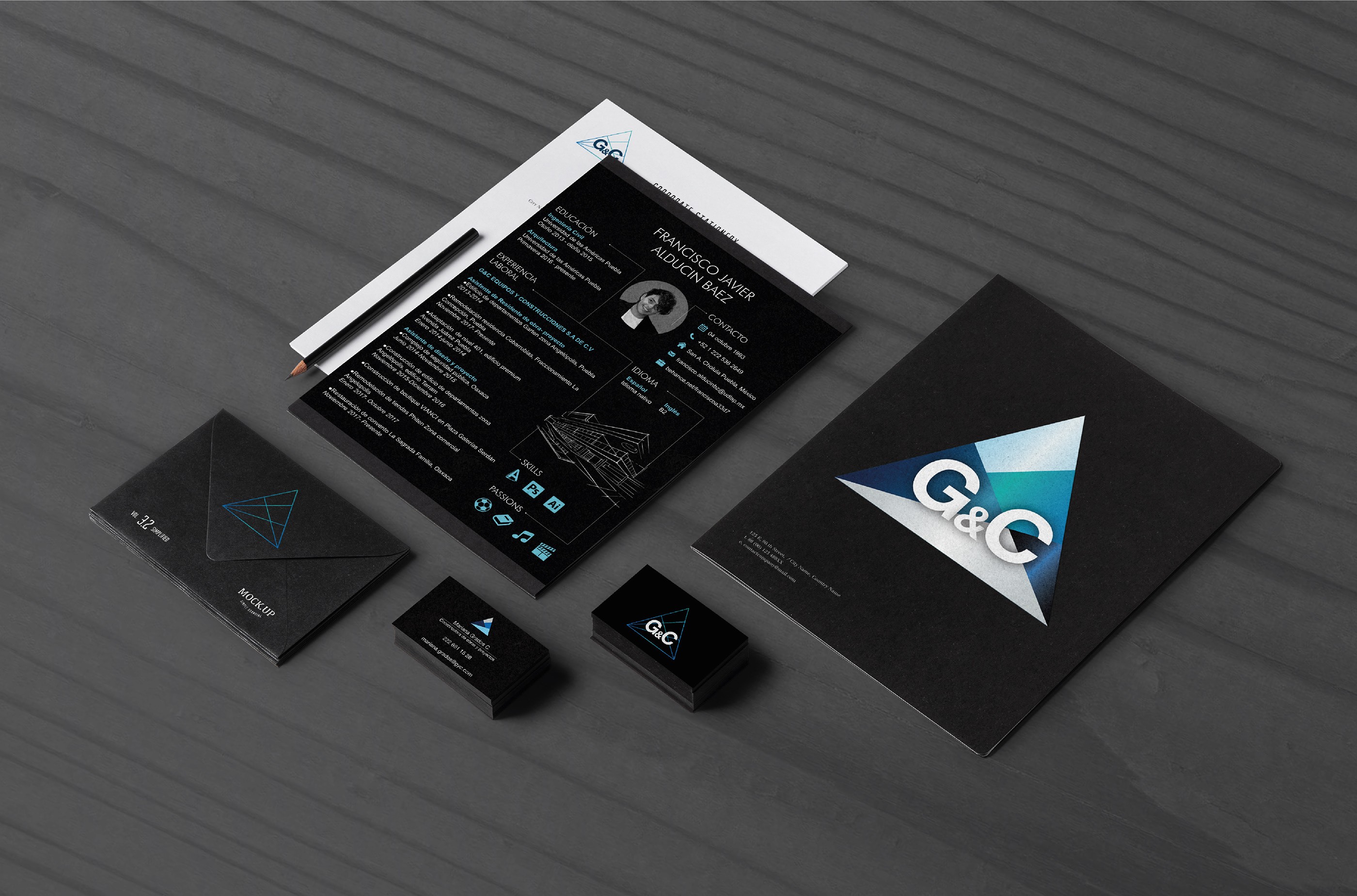
Several variations were designed to ensure adaptability:
Solid-shape versions allowing multiple color combinations, each representing a member of the team.
Line-based versions designed to integrate with background images for project presentations and promotional materials.
Reduced versions optimized for small-scale applications.
This state-based approach allows the brand to remain consistent while adapting to different contexts.
The visual system was extended beyond the logo to create a recognizable corporate identity.
Brand elements were applied across stationery, internal documents, presentations, and communication materials. The system was designed to remain coherent across print and digital formats.
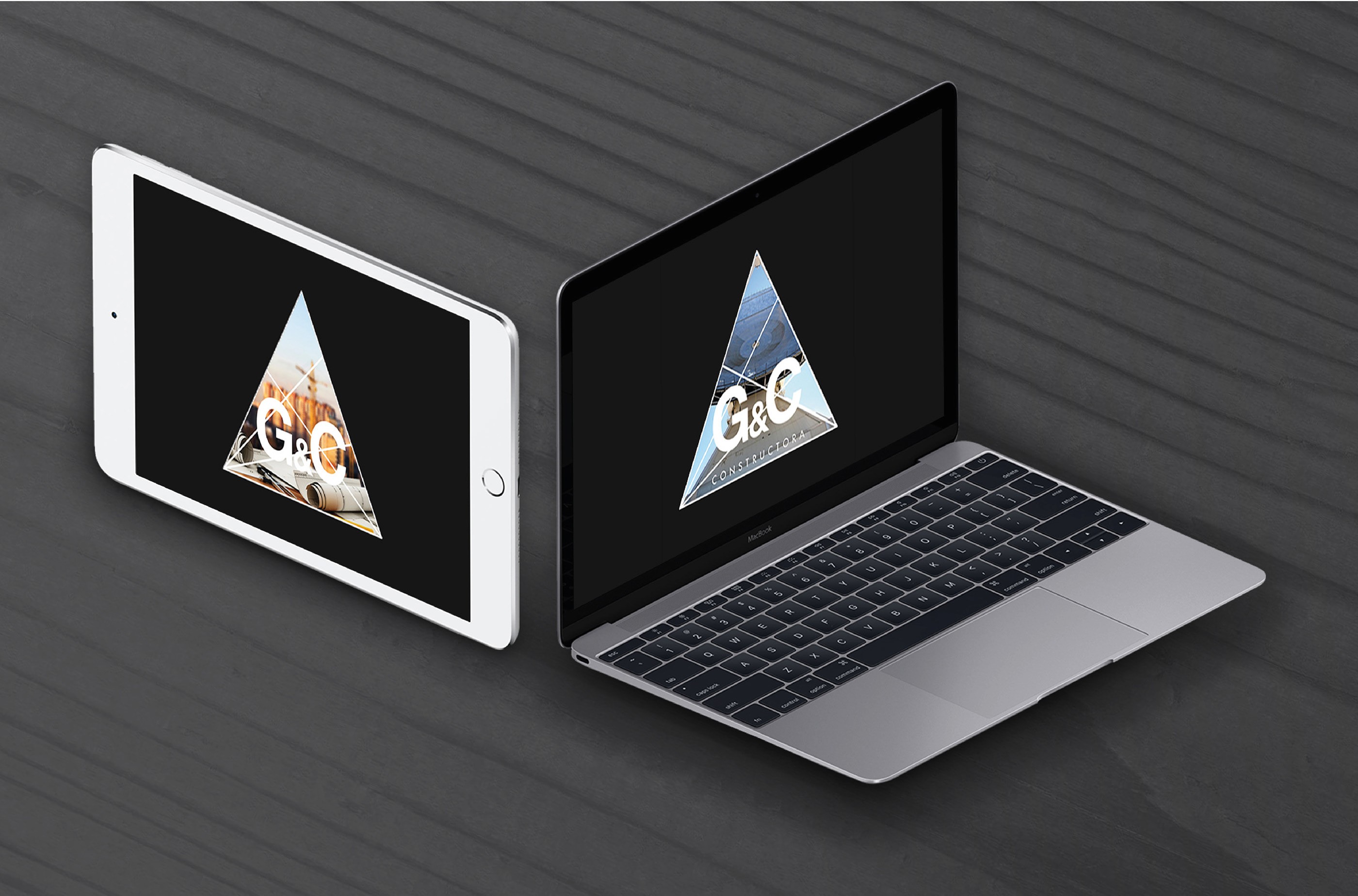

The initial website was designed as GyC’s first digital platform. Its primary purpose was to translate the newly defined brand system into a clear and structured interface.
A landing-page architecture was chosen to present services, projects, and company values in a straightforward way. Webflow was used to ensure flexibility, allowing the site to grow and be updated without compromising the visual identity.
This version established GyC’s presence online and served as a functional baseline rather than a final product.
As part of rebuilding and refining my portfolio in 2026, I revisited this project to explore how the website could be improved using current tools and workflows.
Rather than redefining the brand, this iteration focuses on evolving the digital experience: improving layout structure, hierarchy, and overall clarity, while staying true to the original visual system.
The website is being recreated and enhanced using Cursor and Claude Code, treating the redesign as both a practical upgrade and a learning experiment. This approach allows me to explore new ways of designing and building interfaces, while adding deeper documentation and rationale to the project over time.
This phase also sets the foundation for expanding the case study with new screens, interactions, and technical insights.
The following steps outline how the website was restructured, built, and deployed. from initial definition to a live implementation.
Revisiting this project reinforced the idea that websites are never finished artifacts.
Design systems, tools, and workflows evolve, and strong foundational decisions make it possible to adapt without starting from scratch. Treating this project as a living case study allowed me to connect past work with present capabilities and future exploration.